A picture is worth a thousand words. That's why I decided to add screenshots to my blog. You, my readers deserve screenshots.
However I had no idea how to do it. I googled it and came up with this link:
http://homepage.mac.com/sarafro/tutorials/screenshot/index.htm#elem
It is ridiculously easy to do. This is one of the times that I want to kiss my Mac. You may notice an abundance of screenshots in the posts below. I'll probably settle down after a few posts.
I hope these help. Let me know what you think.
Friday, April 29, 2011
Making a Solid Colour Border
As promised last night I'm going to show you how to make a simple solid coloured border in Photoshop Elements.
At the top menu is SELECT click on ALL. You will have the marching ants around the perimeter of the graphic.

Then, on the same top menu click on EDIT and pull down to STROKE (OUTLINE) SELECTION. Here's a screenshot.
When you do that a SELECTION box will pop up. Don't stress, it's very straight forward.
Let's start from the top of the box and explain.
-Width-how many pixels wide do you want your border. Between 10px and 15px makes a nice border.
-Colour-If you click on this box it will open up the colour dialog box.
NOTE:
To have a border that matches your graphic you can use the eyedropper tool to Select a colour. I used the eyedropper tool to choose the colour of the girl. If you do this you can ignore the colour menu. (just cancel)
-Location-Select centre.
-Blending MODE- Just leave it at Normal. There is a pull down menu here, but don't worry about that now.
-Opacity-Pay attention to this. You want it to be at 100% for a solid border.
-Transparency- Make sure it is unchecked.
Click on OK.
Then to get rid of the marching ants, go to the SELECT menu at top of page and choose DESELECT from the drop down menu. Or you can use Command-d
Finished!
 | ||
| original graphic |

Then, on the same top menu click on EDIT and pull down to STROKE (OUTLINE) SELECTION. Here's a screenshot.
 | |
| Notice the selected border. |
 | |
| This is the SELECTION box. |
-Width-how many pixels wide do you want your border. Between 10px and 15px makes a nice border.
-Colour-If you click on this box it will open up the colour dialog box.
 | ||
| Choose your colour. |
To have a border that matches your graphic you can use the eyedropper tool to Select a colour. I used the eyedropper tool to choose the colour of the girl. If you do this you can ignore the colour menu. (just cancel)
-Location-Select centre.
-Blending MODE- Just leave it at Normal. There is a pull down menu here, but don't worry about that now.
-Opacity-Pay attention to this. You want it to be at 100% for a solid border.
-Transparency- Make sure it is unchecked.
Click on OK.
Then to get rid of the marching ants, go to the SELECT menu at top of page and choose DESELECT from the drop down menu. Or you can use Command-d
 |
| Matching, solid border. |
Finished!
Thursday, April 28, 2011
NeonSun STUDIOS - Adventures in Photoshop
After noticing a recent, sudden spike in visitors from all over the world I decided to google my blog.
If you are here to see naked woman then just go away. You should be ashamed.
If you are here to learn more about photoshop as I discover more techniques and resources then I welcome you to my new layout. I decided to brighten things up for spring.
I have to apologize for my lack of attention. I'm planning a trip to Europe and trying to load my ipod touch with a lot of apps that will help me keep in touch. It's also a bit of a learning curve trying to use it. It's complicated by the fact that no one at the Apple store bothered to mention that ipod touch is pretty much useless unless you have a wireless connection.
I don't have a wireless connection in my house so I've been spending too much time at Safeway, which oddly enough has the only FREE wifi in the city. Although if you have a library card you can connect for free in the libraries. Other than that I have to drink a lot of coffee in a wifi hotspot.
While in London I'll be taking a Tim Holtz grungeboard workshop with Suzie Jefferson of 1st Floor Flat (check the sidebar for the link). The shop that it's in is across from the British Museum. So this is pretty much the perfect day for me.
I'm going to take as many pics as possible of all manner of things, so I can use them in my artwork. Will be on the lookout for ephemera. Any suggestions are appreciated. So look forward to some clipart freebies here.
I was playing around with some soft brushes in Elements. I sized the brushes at 300px then overlapped them.
Next I:

ENHANCE->ADJUST COLOUR->COLOUR VARIATIONS to play around with toning and make the brushstroke meld together. It's a great way to make some texture of your own.
 On the piece below I added a TEXTURE from the FILTER menu called TEXTURIZER.
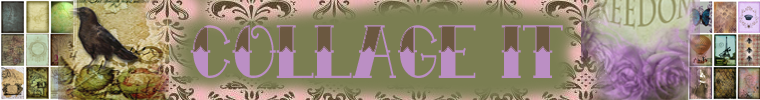
You may of noticed the new header on my blog. It's the same one as I used for my Etsy shop. I saved it as a PSD so as to make changes at a later date. Taking the time to save your work as a PSD is really worth the time. There are a lot of times I wished I had of done it. In this case, I was able to use the header from my Etsy shop and make it larger for my blog. It gave me an opportunity to add some more graphics and change the font and colour and size of the font.
Crow & background courtesy of Land of Nod. Faded text brush by Starwalt Designs.
The end result is still another change. You can see that header at the top of the page.
It's almost 3am so I'll stop there and next post I'll explain how to make a solid colour frame as seen above. The colour of the frame can be 'picked from the actual artwork to make it fit in instead of stand out.
If you are here to see naked woman then just go away. You should be ashamed.
If you are here to learn more about photoshop as I discover more techniques and resources then I welcome you to my new layout. I decided to brighten things up for spring.
I have to apologize for my lack of attention. I'm planning a trip to Europe and trying to load my ipod touch with a lot of apps that will help me keep in touch. It's also a bit of a learning curve trying to use it. It's complicated by the fact that no one at the Apple store bothered to mention that ipod touch is pretty much useless unless you have a wireless connection.
I don't have a wireless connection in my house so I've been spending too much time at Safeway, which oddly enough has the only FREE wifi in the city. Although if you have a library card you can connect for free in the libraries. Other than that I have to drink a lot of coffee in a wifi hotspot.
While in London I'll be taking a Tim Holtz grungeboard workshop with Suzie Jefferson of 1st Floor Flat (check the sidebar for the link). The shop that it's in is across from the British Museum. So this is pretty much the perfect day for me.
I'm going to take as many pics as possible of all manner of things, so I can use them in my artwork. Will be on the lookout for ephemera. Any suggestions are appreciated. So look forward to some clipart freebies here.
I was playing around with some soft brushes in Elements. I sized the brushes at 300px then overlapped them.
Next I:

ENHANCE->ADJUST COLOUR->COLOUR VARIATIONS to play around with toning and make the brushstroke meld together. It's a great way to make some texture of your own.

 | ||
| © NeonSun Studios 2011. All rights reserved. |
 | |
| This was the first banner I made without border. |
 | |
| #2 with border |
 | ||||||||||||||||||||||||||||||||||||||||||||||||||||||||||||||
| I didn't like the name, border colour, font or the collage sheets at either end. |
The end result is still another change. You can see that header at the top of the page.
It's almost 3am so I'll stop there and next post I'll explain how to make a solid colour frame as seen above. The colour of the frame can be 'picked from the actual artwork to make it fit in instead of stand out.
Saturday, April 23, 2011
NEW LINKS
Did you ever take a great photo of your kid only to realize your thumb was on part of the lens? Well that's your problem.
However if you took a great photo of your kid at the garbage dump or some other unattractive surrounding I have a solution for you. I came across a great series of tutorials to extract any object from any photo. Here it is:
http://wegraphics.net/blog/tutorials/photoshop/photoshop-for-beginners-techniques-to-extract-anything-from-its-background/
Another well laid out site that offers tutorials is:
http://www.photoshopmosaic.com/Photoshop-tutorials/1
It has literally hundreds of thumbnails of different techniques. It's geared towards people with the full photoshop. However, a lot of tuts are easily used with Elements. This is how it works. People submit links to tutorials they have made and they are reviewed and then posted on the site. If you make a tut then you can submit it as well.
I added another link from Enrique Flouret to a very similiar site he runs because in addition to the tut, he has a plethora of links and resources. It's called the Photoshop Roadmap.
Good luck with these. They will keep you busy for awhile.
Before I go I'd like to leave you with one more link.
http://graphicriver.net/
This site has a few freebies. Overall you can buy font files (if you couldn't figure out the carved ice text tutorial), templates and lots of other graphic elements. These are very inexpensive starting at $2. This site is extremely safe for downloading.
You will find these links at the top of my link list.
Happy Easter!
Saturday, April 2, 2011
FRIDAY NIGHT ARTS & CRAFTS
Planning a trip to London, UK. Of course the first thing to do (besides buying a ticket) is to make a travel journal. Naturally the background is a British flag.
 I wanted the flag to look more like material so I added a muslim texture. This is a favourite of mine. Then used mutiply on the drop down LAYERS menu.
I used the rectangle shape tool to make a background for my text. I used the paint bucket to add colour. But it looked too flat so I added a texture by Darkwoods. Then used mutiply on the drop down LAYERS menu.
By that point the background was really dark and I wanted my rectangle to be lighter so I could add text and pics.
Filter -> Render-> Lighting Effects and added a spotlight with a #fffefd in the white Intensity box. and played around until it was light enough to show my text.
Believe it or not the background edges (not affected by the spotlight) were too light,.
So I used the rectangle marquee tool. At the top where the little boxes are I clicked on, ADD to Selection and at the top I made the MODE Normal. I made my selection and under EDIT->Stroke (Outline) Selection. In the pop-up screen I reduced the transparency to 75% and changed the colour to a dark brown.
The text is Marker Felt which I got from Da Font (check my links). The size is 30 points. Then I added some amazing pngs, a penguin, suitcase and crane from JoesSistah.
http://www.flickr.com/photos/27805557@N08/sets/72157614731027787/
The top hat is from Creative commons.
The train image from
http://www.cpaphilblog.com/2009/02/train-vintage-postcard-and-record.html
The other images such as the photo corners and button came from Photoshop Elements on the right side of the page that says, CONTENTS->Filter for graphics.
The ballon is from an old purchased image that I added one of my backgrounds to.
http://www.etsy.com/listing/59886052/collage-sheet-paris-shabby-chic-themed
With both the train and balloon images I used the eraser tool. The eraser 'brush' I used was fuzzy and about 300. I used that to clean away parts of the images that I didn't want. I like using this method as the graphics edges fade into the background nicely.
So I guess you want to see the end result? Here it is.
Then I printed it out on a white stickyback paper, (Avery Sticker Project Paper #03383) trimmed it and put it on the front of my Travel Journal.
To protect it (because it rains a lot in London) I sprayed two coats of Krylon Preserve It. I chose not to have it fill the whole front of the notebook because I wanted to use the ton of Washi tape I have. So I framed it in a few layers of washi tape. The tape also is folded over the edges of the notebook to make a clean edge and add durability. When I finish it I will post a pic.

 |
| Shadowhouse Textures (see links) |
I used the rectangle shape tool to make a background for my text. I used the paint bucket to add colour. But it looked too flat so I added a texture by Darkwoods. Then used mutiply on the drop down LAYERS menu.
 |
| http://www.flickr.com/photos/darkwood67/4891201609/in/set-72157623706589781 |
Filter -> Render-> Lighting Effects and added a spotlight with a #fffefd in the white Intensity box. and played around until it was light enough to show my text.
Believe it or not the background edges (not affected by the spotlight) were too light,.
So I used the rectangle marquee tool. At the top where the little boxes are I clicked on, ADD to Selection and at the top I made the MODE Normal. I made my selection and under EDIT->Stroke (Outline) Selection. In the pop-up screen I reduced the transparency to 75% and changed the colour to a dark brown.
The text is Marker Felt which I got from Da Font (check my links). The size is 30 points. Then I added some amazing pngs, a penguin, suitcase and crane from JoesSistah.
http://www.flickr.com/photos/27805557@N08/sets/72157614731027787/
The top hat is from Creative commons.
The train image from
http://www.cpaphilblog.com/2009/02/train-vintage-postcard-and-record.html
The other images such as the photo corners and button came from Photoshop Elements on the right side of the page that says, CONTENTS->Filter for graphics.
The ballon is from an old purchased image that I added one of my backgrounds to.
http://www.etsy.com/listing/59886052/collage-sheet-paris-shabby-chic-themed
With both the train and balloon images I used the eraser tool. The eraser 'brush' I used was fuzzy and about 300. I used that to clean away parts of the images that I didn't want. I like using this method as the graphics edges fade into the background nicely.
So I guess you want to see the end result? Here it is.
 |
| ©Neonsun Studios, All right reserved 2011. |
To protect it (because it rains a lot in London) I sprayed two coats of Krylon Preserve It. I chose not to have it fill the whole front of the notebook because I wanted to use the ton of Washi tape I have. So I framed it in a few layers of washi tape. The tape also is folded over the edges of the notebook to make a clean edge and add durability. When I finish it I will post a pic.
Subscribe to:
Posts (Atom)